
We syndicate this blog post from Joanne Nova (joannenova.com.au) both because it is interesting in its own right, and because The Lancet, the journal responsible for publishing the dishonestly scaled graph regarding heat deaths, covered in this blog post, was also responsible for considerable amounts of misinformation regarding the dangers of Covid, the supposed ‘ineffectiveness’ of therapies such as Ivermectin, and the claimed ‘safety and effectiveness’ of the mRNA therapies.
Given their dishonesty now so obviously extends to the issue of Climate Change, The Lancet is perhaps best thought of as a source of junk popular ‘science’ rather than a serious scientific journal.
What do you do when not enough people die to suit your religion? Distort the axis and hope no one notices.
Welcome to government-science, where one of top journals in the world uses graphic design tricks for political convenience. In this graph from the paper, 10 excess deaths from the heat looks “bigger” than 50 excess deaths from cold. Isn’t the whole point of a graph so we can compare the bars “at a glance”?
Björn Lomborg corrected this with chart on right. Doesn’t that tell a different story?
Thanks to Patrick Moore @EcoSenseNow:
The journal “Lancet” published the chart on left with unequal X-Axis* to downplay fact that cold causes 10X more deaths than heat in Europe. …This is disgraceful for a supposedly scientific journal.
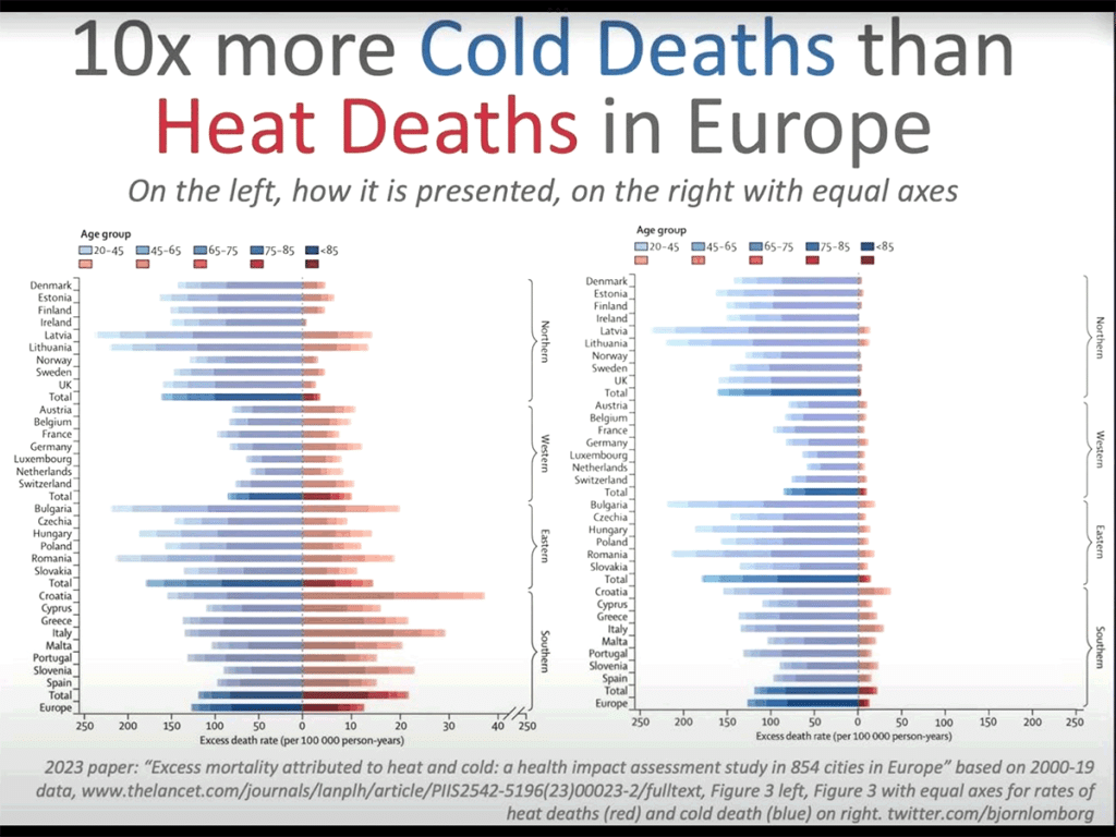
Björn Lomborg‘s version shows us exactly how important heat deaths are. It’s no small thing. The news outlets are filled with heatwave porn trying to scare people about normal weather, while politicians try to justify spending billions to “cool” the world. These graphs hide the crime — increasing the cost of energy will kill far more than mythical cooling could ever save.
This is symbolic of the state of Science today: distorted by government funding until the point of it disappears.
The Lancet is the world’s highest impact medical journal. It was founded in 1823, so it’s their 200th anniversary year, yet despite that, they thought they’d risk their reputation anyway…
What, exactly, did the peer reviewers think? Presumably they told themselves it was the only way to show the detail of the age groups on the heat deaths side.
Here’s a close up of the scale. Note the break marked on the far right:

We discussed this paper on the blog a week or two ago: Even in cities, cold kills ten times as many people.
It reminds us of the time Steven Sherwood changed the color on the hot spot graph so a zero degree trend looked hot red instead of yellow.
It’s a sign of desperation.
REFERENCES
Masselot et al (2023) Excess mortality attributed to heat and cold: a health impact assessment study in 854 cities in Europe, The Lancet, DOI:https://doi.org/10.1016/S2542-5196(23)00023-2
*Corrected from Y-axis. I’m sure that’s what Patrick Moore meant.
You can read more of Jo Nova’s blogs on site here